Work2026
The Mill
- Client
- The Mill — Interior Design & Fitout, Muscat
- Year
- 2026
- Role
- Brand Strategist | Creative Director | Designer
- Services
- Brand strategy, verbal identity, logo system, colour, typography, applications — 32-page brand book
An interior fitout company in Muscat with a good reputation, a real audience, and no brand. What existed was a logo, a website, an Instagram account, and the founder’s own way of describing the work.
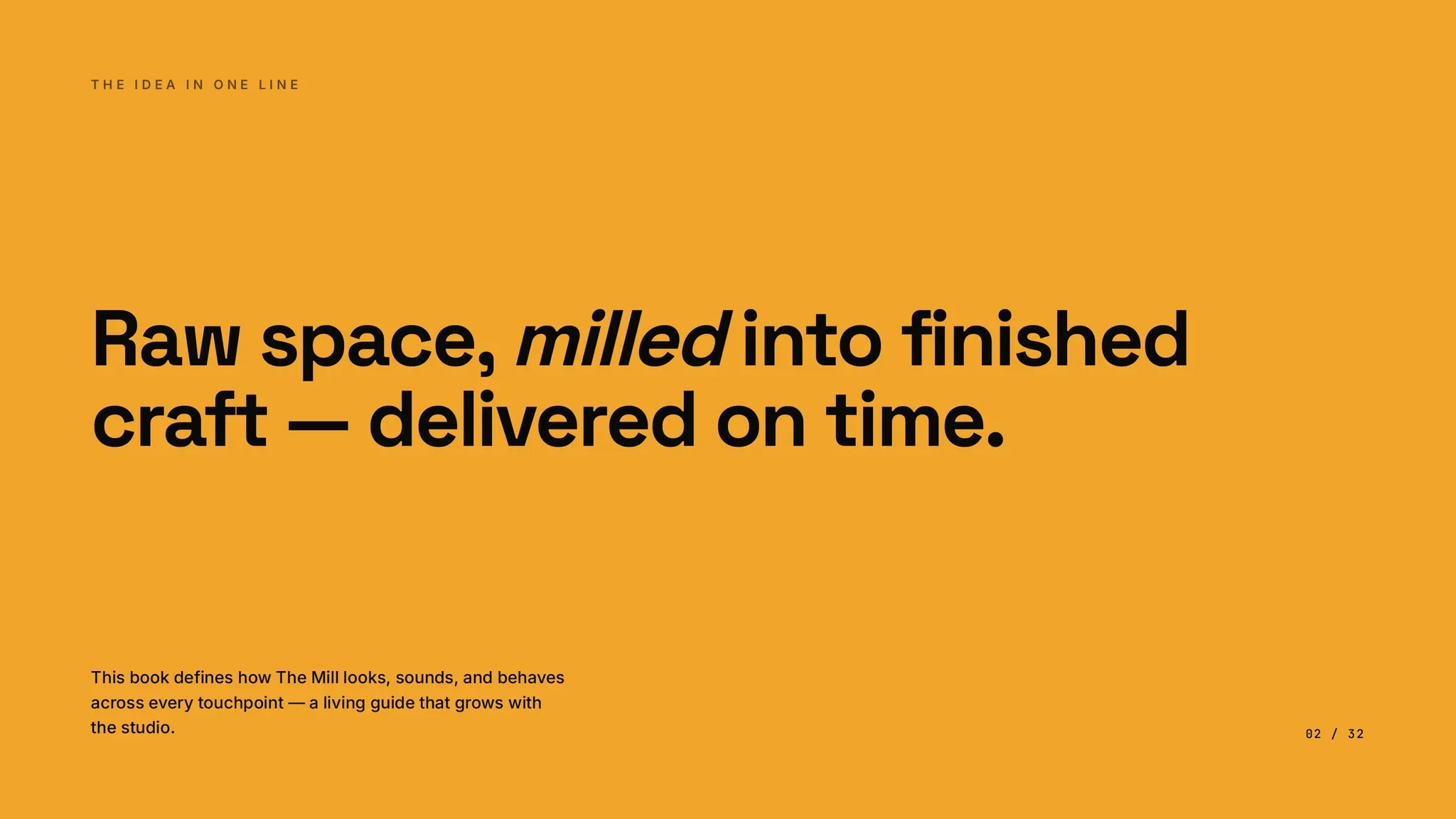
So the identity was excavated rather than invented. The name already carried the whole argument — a mill is where raw material is ground and finished into something useful — and the business does exactly that to empty commercial space. Raw milled into finished became the spine of the book, and the brand essence came out as five words: Milled to finished. On time.
The logo was treated as an evolution, not a redesign. Its most distinctive feature, an angular diagonal across the tops of the M and the double L, was named the Mill Cut and promoted from decoration to system: dividers, image crops, before-and-after separators, a standalone monogram. It reads as a blade. Used consistently it ties every application back to the logo without ever repeating it.
The verbal identity carries as much weight as the visual. Muscat fitout brands compete on price and read cold and corporate, so the voice was set as strong, patient, supportive, and the book gives a two-column table of what The Mill sounds like against what it does not — “Handed over in nine weeks, exactly as scheduled” against “World-class turnkey solutions.” Numbers, materials and timelines build trust; adjectives erode it. There is a list of banned words.
Arabic and English carry equal weight throughout, written as original copy in both, never translated.
32 pages, three parts: the brand (foundation, positioning, values, voice, verbal identity), the visual identity (logo system, the Mill Cut, colour, typography, photography, iconography), and applications (touchpoints, social standards, what the brand is not).
Built from the founder’s own words, the existing logo, the website, and a live audit of the Instagram account — 162 posts, 7,658 followers.
Case study
The name already held the strategy — excavate the brand, don't invent it.
The Mill — Interior Design & Fitout, Muscat. 32-page brand book, July 2026.
The challenge
The Mill had a reputation, a real audience, and no brand. What existed was a logo, a website, an Instagram account and the founder’s own way of describing the work. Muscat’s fitout market competes on price and reads cold and corporate; The Mill was doing better work than that and had no way to say so.
The strategy
The identity was excavated, not invented. The name already carried the whole argument — a mill is where raw material is ground and finished into something useful — and the business does exactly that to empty commercial space. Raw milled into finished became the spine of the book, and the brand essence resolved to five words: Milled to finished. On time.
The logo was treated as an evolution, not a redesign. Its most distinctive feature — an angular diagonal across the tops of the M and the double L — was named the Mill Cut and promoted from decoration to system: dividers, image crops, before-and-after separators, a standalone monogram. It reads as a blade. Used consistently it ties every application back to the logo without ever repeating it.
Execution
32 pages, three parts. Part A: brand foundation, positioning, values, personality and voice, verbal identity. Part B: logo system, the Mill Cut, colour, typography, photography, iconography. Part C: applications, social standards, what the brand is not, credits and versioning.
The verbal identity carries as much weight as the visual. The voice is set as strong, patient, supportive, and the book gives a two-column table of what The Mill sounds like against what it does not — “Handed over in nine weeks, exactly as scheduled” against “World-class turnkey solutions for all your needs.” Numbers, materials and timelines build trust; adjectives erode it. There is a list of banned words: best, leading, world-class, passionate, cutting-edge, solutions, synergy.
Arabic and English carry equal weight throughout — written as original copy in both, never machine-translated.
The palette is drawn from the logo and disciplined to 60/30/10, amber used sparingly because its rarity is its power. Positioning was mapped against the local competitive set. Sector focus was narrowed — restaurants, retail, spas, cafés, boutique hospitality, offices; no residential — on the principle that focus sharpens a brand.
Grounding
Built from the founder’s own words, the existing logo, the website, and a live audit of the Instagram account: 162 posts, 7,658 followers. The book’s own line about that audience: the brand’s job is to make it feel the quality the work already has — through consistency, not more volume.